Holabird Sports // 2017 – 2019
The Solution:
An Updated Brand Identity
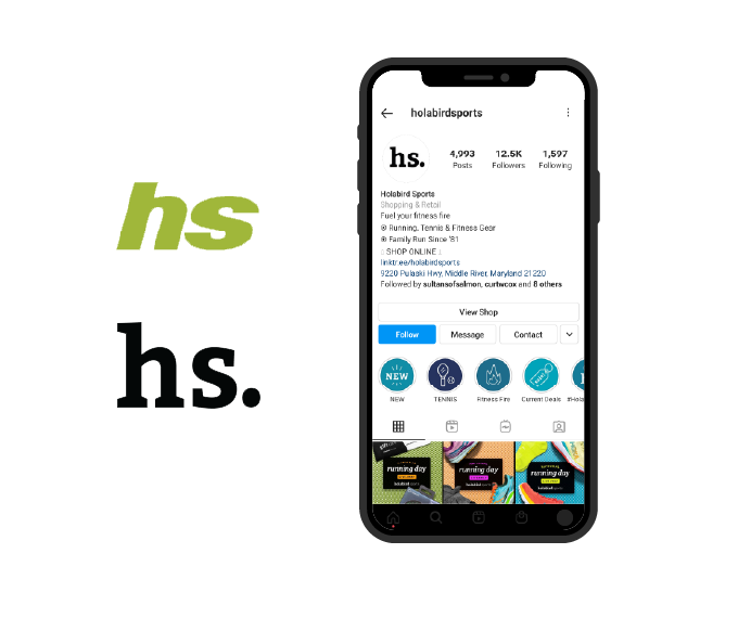
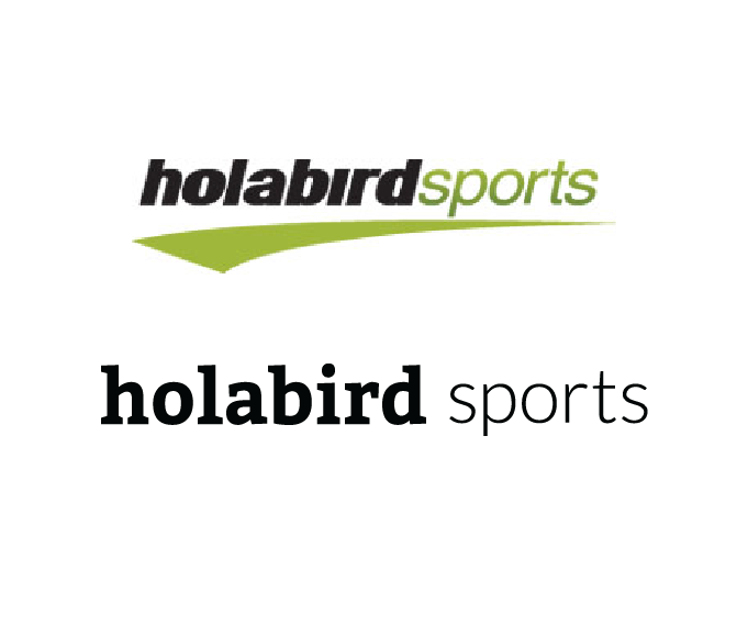
While conducting customer research, two main themes emerged: the high quality of Holabird products, and the charming personal touch of the company. We stuck with the “hs” customers would recognize, making that the primary logo, and swapped the cold sans-serif for a warm yet chic serif font including a period at the end – a nod to the company’s digital future.
& a custom mobile first UI based on in-house expertise
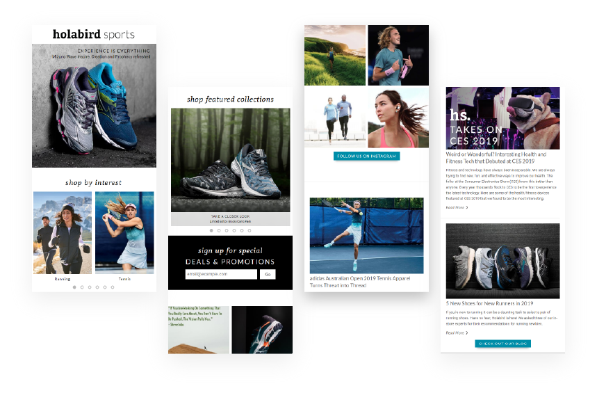
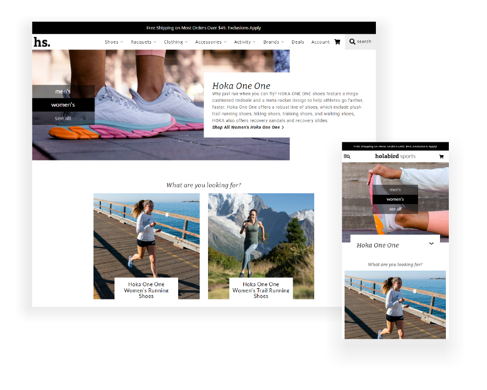
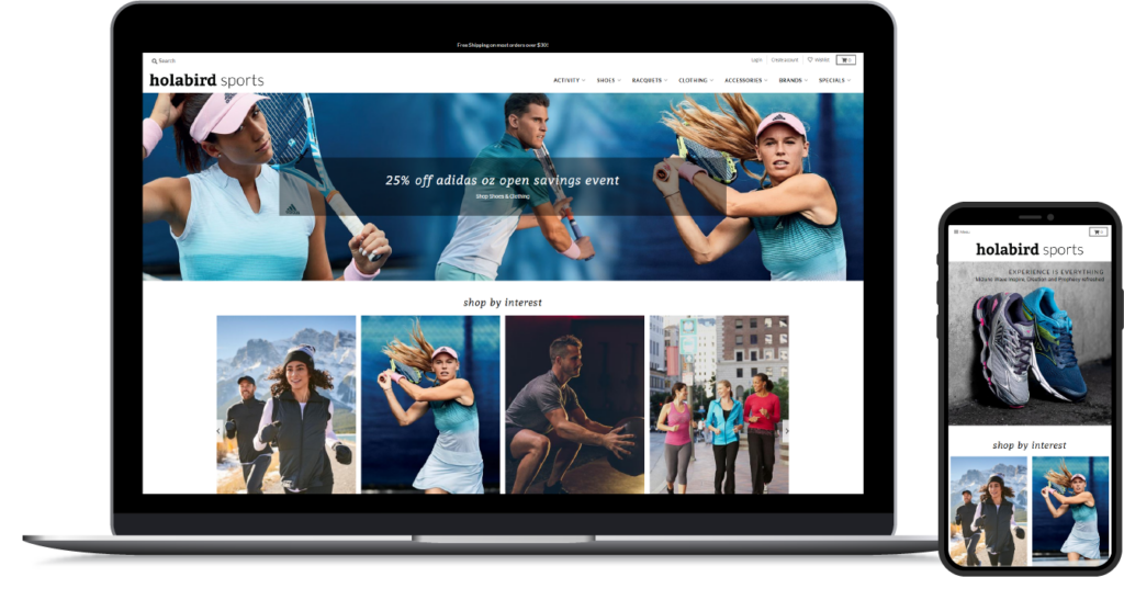
The original Holabird Sports website read like a catalogue, with no room for personality – only products. The need to streamline the extensive product catalogue intersected with an antithetical goal: to reflect why every item is handpicked by our product experts, and we needed to display all of this information in a way that’s still mobile friendly.
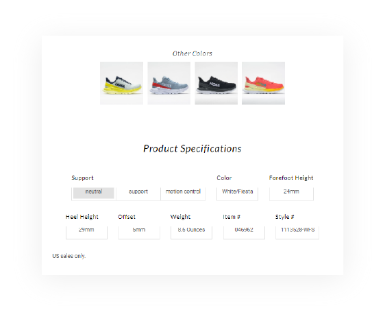
We designed and built a custom landing page structure to allow users to effortlessly navigate complex product categories and specifications. Informative and SEO optimized content is located in a modern header at the top of all catalogue pages, resulting in an increase in traffic and conversions. Product specifications, from racquet weight to forefoot height are highlighted so customers know exactly what they’re getting. And finally, the voice of our product experts was showcased in the new “Fitness Fire” blog. We found a way to say more with less, and according to the reviews it paid off.
